Graphics Exploration
During the design of Kricket’s new London Restaurant, which involved interior design as well as in-venue graphics, we explored lots of creative graphical avenues. Many of which came to life in the final design, but a few others didn’t make the cut. Sometimes for cost reasons and other times because we decided less was more. But we still let our imaginations run riot in the concepting phase.
See the final design over here.
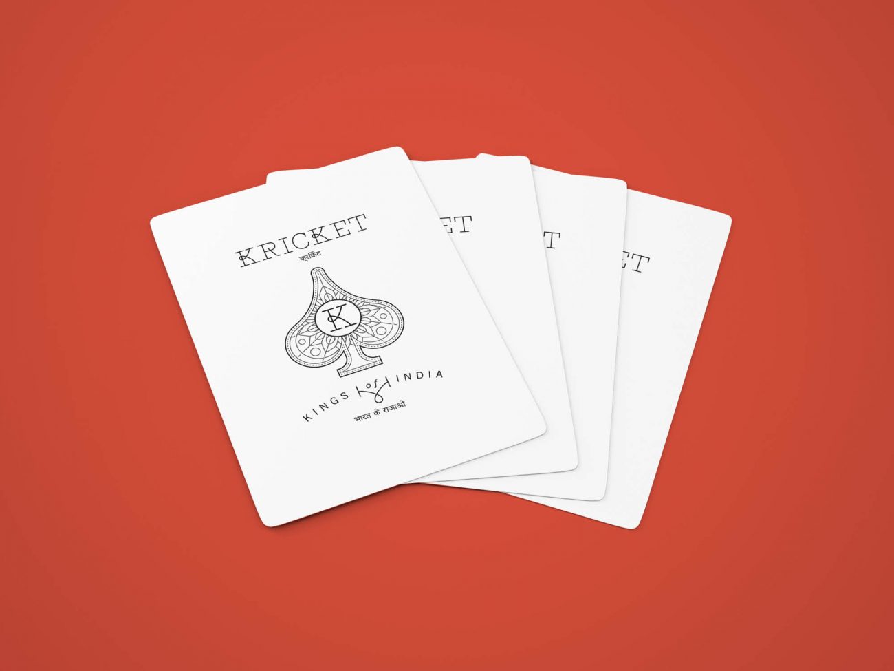
As well as exploring what the menu might look like, our graphics team also explored devising a bunch of little details that often make the biggest difference to a design, making it really unique. We took inspiration from the quirky finds our interiors team tracked down, springing off from the pattern or styling of a tile, to create a new detail which feel like part of the same family.
Wallpaper Designs
The basement WCs in the final cut were embellished simply with dark and stormy paint and some lovely vintage tiles. But earlier in the creative process, we’d had fun exploring a range of conceptual wallpaper ideas. Which we then decided to hold off on. We might have given diners nightmares if we’d overloaded the compact and bijou space in each cubicle. So we decided less was more.
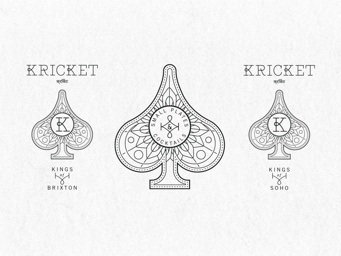
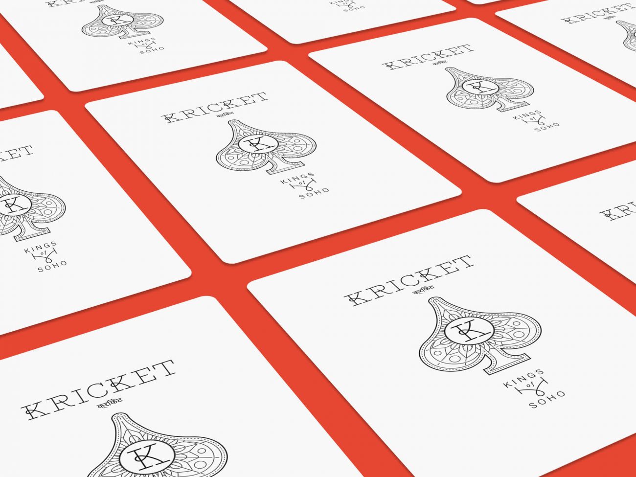
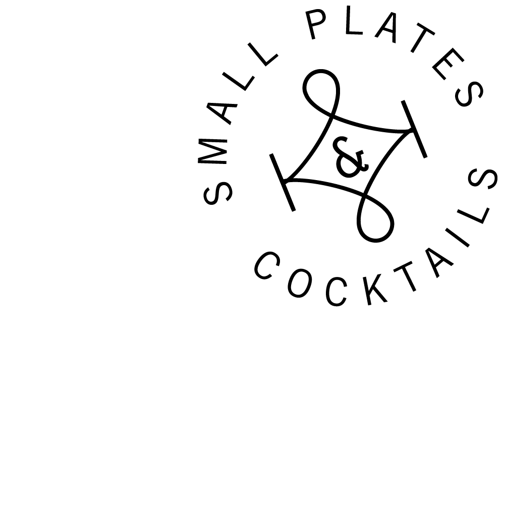
Kings of Soho
Our concept design involved the development of a really varied range of graphic devices and ideas. Some of which we pushed ahead with, others we put into the back pocket.
Signage & Wayfinding
We also created quite a quirky concept for the restaurant’s wayfinding, taking an old favourite pointy finger device, but giving our hands an Indian inspired Henna twist.

The door signage we designed for the unisex washrooms and DDA baby change was drawn freehand by our in-house illustrators and we fashioned another Henna hand from concrete to stop people opening private back-of-house doors, but in a humorous and friendly way.
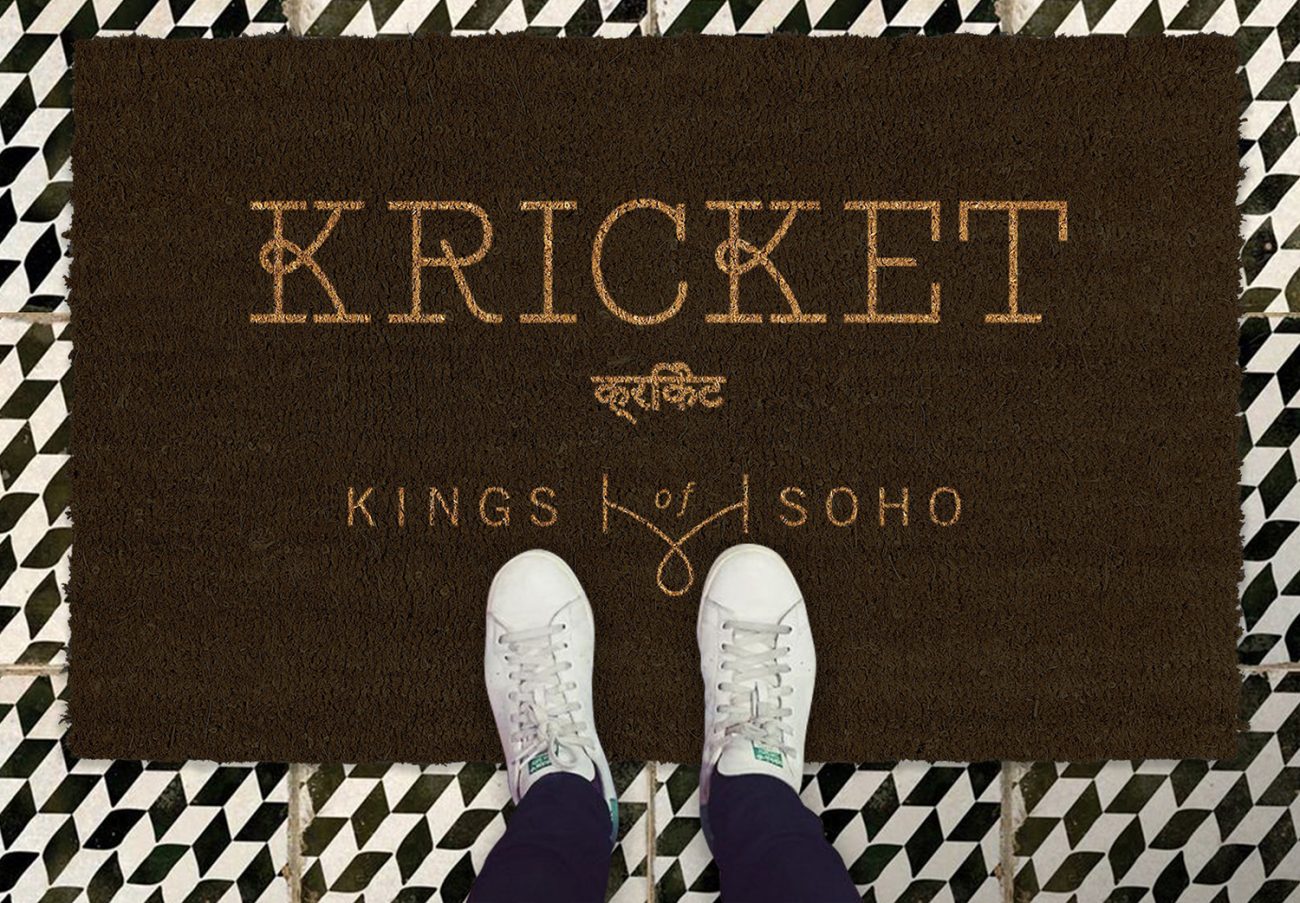
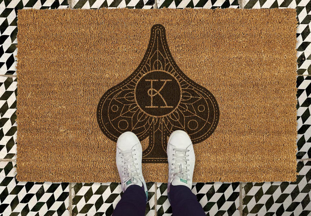
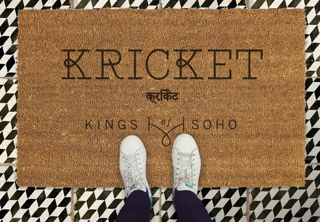
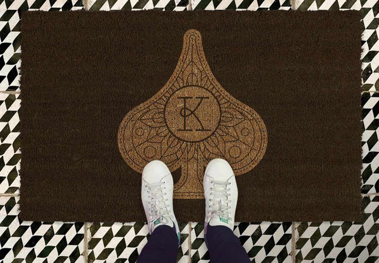
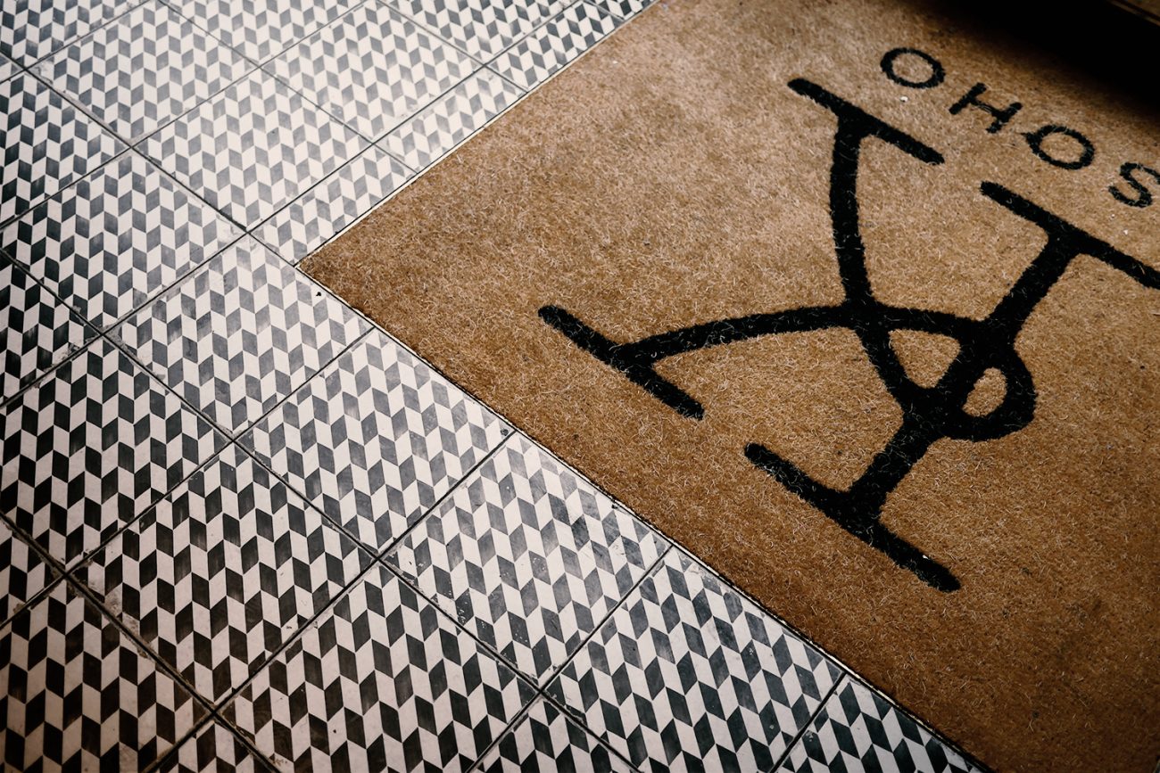
Lots of examples here of our concept designs for the coir mat at the entrance. Most of these proved too intricate and tricky for the production company to cope with, so the end result was something much simpler. We are now on the hunt for a much more rock and roll coir mat company…
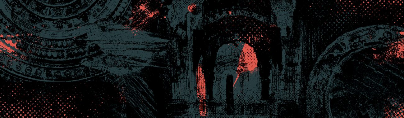
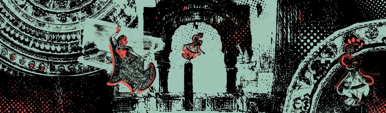
Kumar Vs Run For The Hills
Another fun graphics piece for Kricket. Getting to work in collaboration with British Indian artist Natasha Kumar, to create a really special mural for the Private Dining Room. We used pieces of Natasha’s original artwork, and remixed it, adding halftone and screenprinting effects to give the mash up an urban edge.
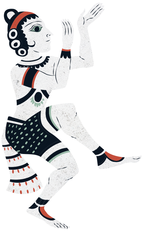
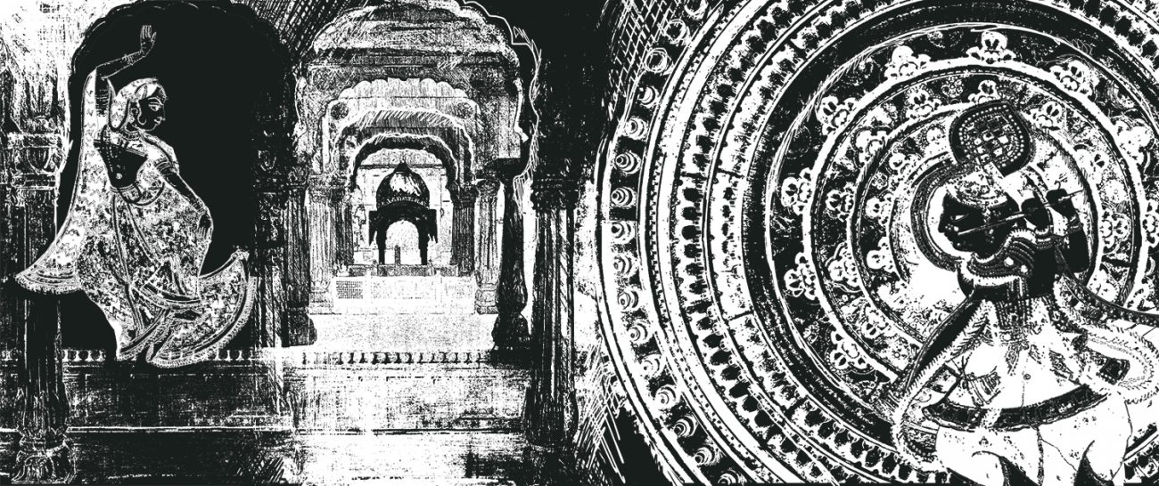
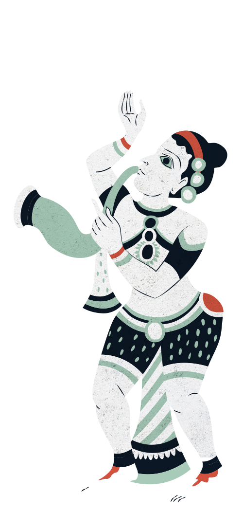
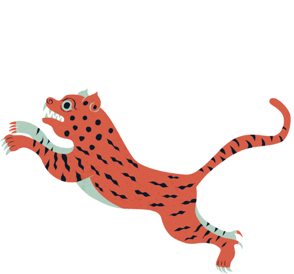
Flavours Of India
Other creative routes for the PDR wallpaper explored using Indian dancing figurines and tigers, hand drawn by our talented illustrator Myoung Chung. Who also experimented with adding layers and layers of 2D and 3D foliage.
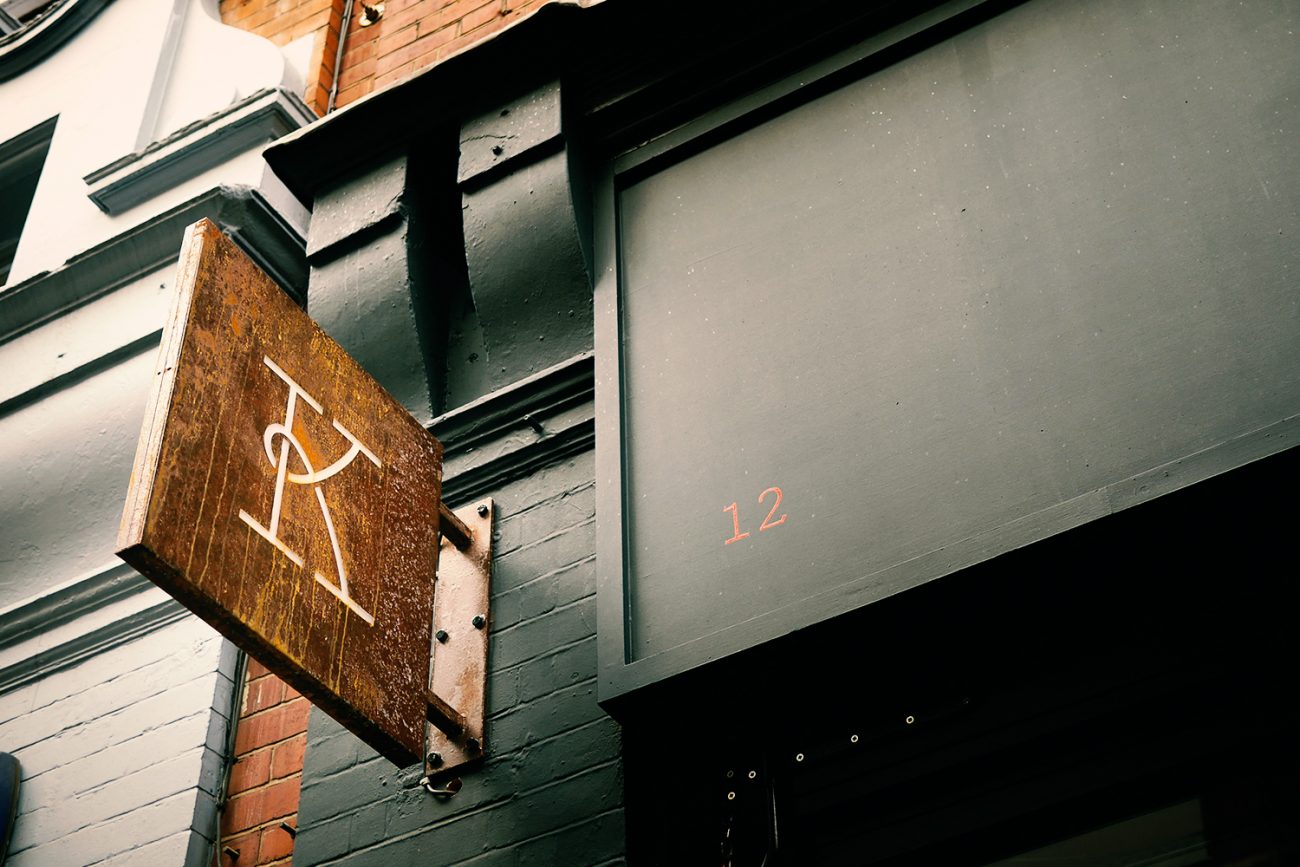
Brand Touches
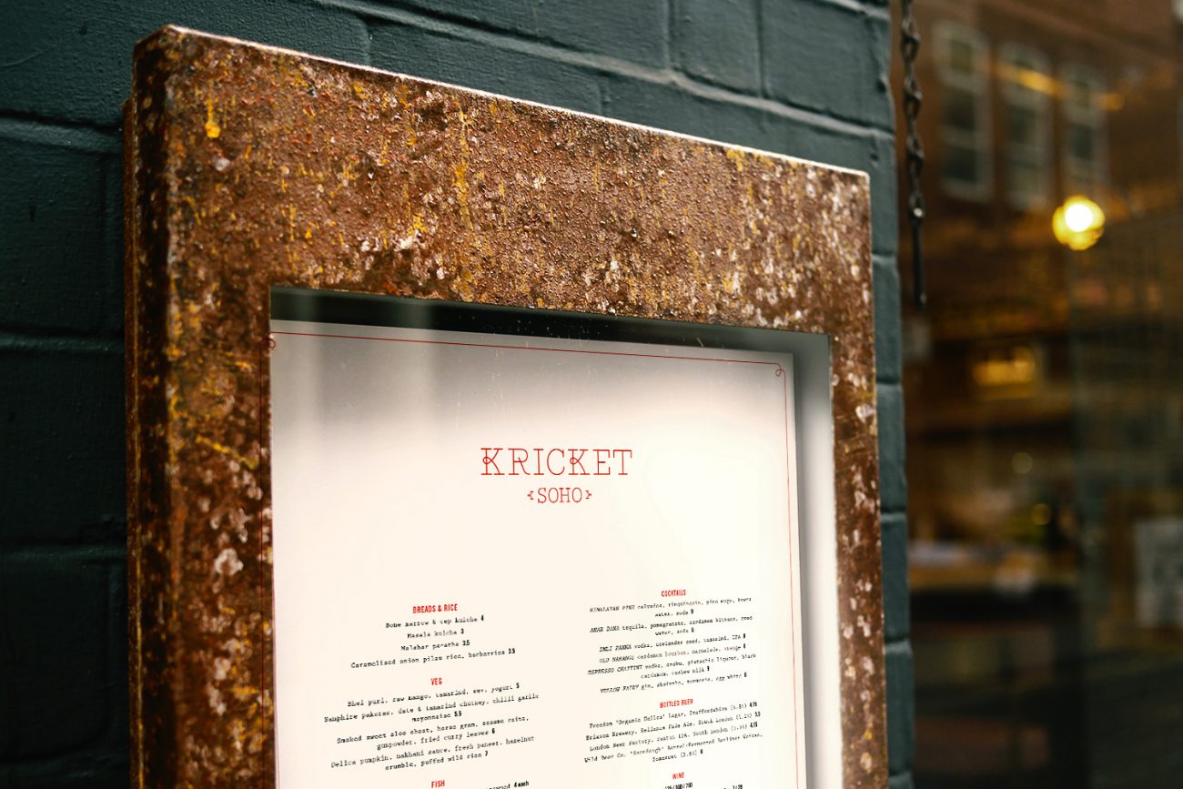
Final brand touches included the crafting of a burnished bronze external menu box and 90 degree illuminated pavement sign. Die-cutting the K of Kricket from the metal, with soft light creating a lovely glow within. The mat at the front door then ushers people into Kricket with a warm welcome.
Kricket’s original brand identity was created by Mind Design. Find out more.
